Friday 25 May 2012

End of the Line

We have finished.... All sound, rendering, comping and editing is finished all that is left to do is hand in our DVD and we are finished.

First thing is that I am really happy with the outcome of the film. We started this film in late January when our dissertation was about to kick in and we have still managed to get all the work we had planned done and to a good standard. 

The Team has worked brilliantly together, Joe and Nick who had the original idea have made a great edit and put some awesome animation that has brought my character to Life. Greg has been a great help all the way, modelling and texturing not just the lift but creating the rig containing both character and has more features than I can list. Steph has been a great compositor on this project learning nuke and in total comping around 20 or more shots, as well as texturing both the Zombie and Intern characters. David has been good help when creating the office set and did some of the first lighting tests for the film.


Thats it! Going Down is finished and hopefully people will enjoy watching it as much as I have working on it.


My Role

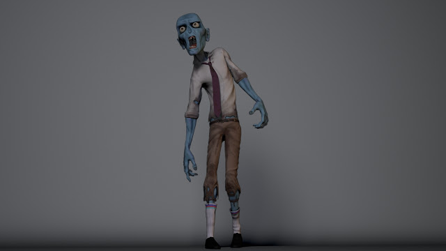
When this project began I was mainly focusing on the Character modelling. In total through out the year I have modelled 4 Characters: Zombie (Below) and Intern for Going Down that I designed and The Vein and Crude wizard for SpellBound. Although as the project developed I became more as a generalist working on all aspects of the project.


The 3 images below show examples of both character for Going Down in a variety of shots. I feel the design of the characters work well together. I would if I had more time rework some elements such as the zombie clothing, where I would improve on the models and add another level of detail. Also with the intern I would do the same, taking everything to the next step.


For both characters I created all the blendshapes used in the film. The intern was the main focus when creating the blendshape as we had be able to make a wide range of facial expressions for the film. The zombie on the other hand mostly had eyebrow movements but we had to make sure it that the jaw worked well as the animation of the zombie relied on a good working jaw. Greg Martin is to thank for that as he created a great control giving loads of room for movement. Also in the image below you can see the outcome of the Hair I created using maya hair system for the Intern character. It was my first try at creating hair and I think the end result works well.


As well as light a big section on the film I also took on the task of creating the render layers for the shots ready to be rendered then be composited by Steph. Each render layer had its purpose and it was my job to make sure that each render layer worked with nuke as it would be waste of time if the render layers didn't work after we had taken the time to render all the frames. I started using nuke to check that what I was doing was working.


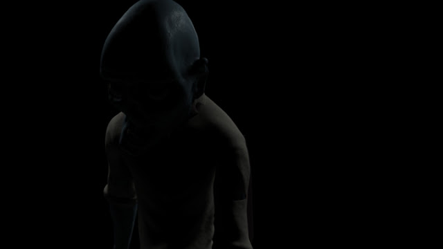
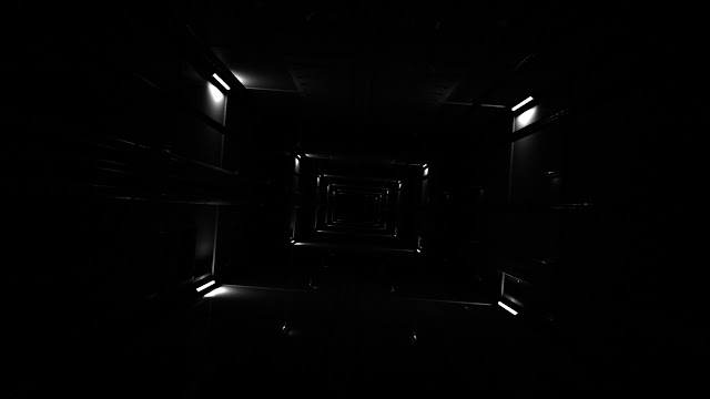
Later on in the project  I took on the task of trying to  composite one of the shots. I composited one of the fast pace blue shots. I found it really enjoyable and felt that I learnt loads from doing that one shot. I even started developing a comped version of my turntable (images at the top of post).


In total I did the lighting for around 8 shots in the film. I also animated 4 Zombies out of the 7 found it the final shot (shot0180).  So all in all, I have worked on every stage on the Going Down film. Also I have worked on environment modelling and texturing in Spellbound as well as developing Grass and Hair for the other two characters.

Tweaking & perfecting

We have managed to get some extra time to re comp and re-render a few selected shots that we felt we could improve in the time we have left.

Animation, rendering and sound is all finished! All we have left to do is get the last of the comps in the edit. Next plan is to sorted out our degree show items and sort out the dvd for submission. Other than that we are DONE!!! I think we are all happy with the outcome. We all feel now we have done it we can do it better but thats always the case.

We have spend alot of time working along side Quality control/ broadcast students as our film has alot of things that could cause some problems when going through quality control. My professional Skills blog explains alot about QC. Here the link! http://professionalskillsok.blogspot.co.uk/


Thursday 24 May 2012

Rendering, Rendering & more Rendering

LAst few weeks have been purely rendering and compositing. We have had 6 pcs working around the clock rendering our film! We are happy that we have managed to get a good level of quality out of our renders without them taking alot of time. If we had more time or if we had started this project from the beginning of the year I think we would of used a high set of settings, but we are all happy with the outcomes we are getting.

Some shots like shot0150 have really made me feel confident that we are going to get a successful film.


Shot0180 has been a huge render to get. Working with Steph we have managed to render 7 zombies! I am  very pleased with the out comes as the shot was developed late on during the project and was a big task to  complete.


Compositing: Shot0148

So it comes my time to composite a shot! I have to admit its a strange shot as we are going for a styled approach for this section of the film. So the idea to create this blue tint to the shot. 

The two images below show my nuke scene and node trees used to created this shot. I found it a good challenge to get the style right and make it fit the rest of the shots that already have been created. 


The image above shows the nuke node tree for the lift composite. The first task is to break down the rendered image into its passes. As you can see its the same Lift image for each section this is because within that image are the passes we created in maya. To split this up we use a shuffle node, we can tell the shuffle node to select the pass we want.

Once we get this sorted we then use merge to bring them together, When I do this it gives you an option of A ad B, when B means it will be on the bottom and A on the top (blue nodes are merge nodes). Diffuse is our base layer with shadow, specular over the top. We do this for both Top lights and Bottom lights then merge them both together with the bottom lights being B and top lights being A.

From there we can control all the elements by adjusting the merge and what image is seen more. Although merges can be set to different types of 'merging'. For example for a shadow we use a merge but with the type of merge set to 'From'. Where as if it was Specular it will be set to Screen. Finally Ambient Occlusion will be set to Multiply.


Below are two images showing the development of the lift. We are mostly blurring the backgrounds to create this style, this is why the end result has the background blurred as we want the characters to be the focus. Although my actual comp of the lift pre blurring was in my opinion good. I liked the tone I got and the variation in the metal but I had to match the same as all the others in the section so adding the blue tint was important. If it wasn't going to be one of the fast pace bits I would of sorted out the specular slightly as it is coming across blurry at moment.


I like the end result. The one problem which is down to 3D problems is the weight variation on the interns leg. I plan to fix this within 3D if we have time but if not we will have to live with it. Its a clumsy mistake to do and I really hope it doesn't bring the section down as I think this and the rest of the shots are looking really cool!


Character Uv's


Here are the final uv's for both characters. I have laid them over multiple uv spaces as I wanted to have more detail on elements and would of had more trouble with that if they were all on one uv space. Also gives me a chance to break the mesh into it shader groups. The uv's were originally done by Josh but there were model changes and topology changes so I had to redo them. Below are some images of the tools I used to create the uv's.

The unfold tool: This tool isn't as used as much as I think it should be. You need to cut up your model well using the cut edge tool in the uv settings and then the unfold tool can give you great advantages to create smooth and even uv's


When you have multiple meshes creating your model you need to keep it organised. One of the best tools to do this is the layout tool. First thing it does is resize the uv's so they are all even, which is exactly what you want as you want the same resolution when it comes to texturing. Also once this is done you can select the group you want to be on the same uv space and it will lay them out for you.


I am happy with how the uv's worked out. Along the way there were a few hick ups but easily fixed and reworked. 


Lighting Shot0150

Shot0150 is one of our beauty shots! Greg was the original lighter on this shot but I felt that the zombie when leaving the lift was way to dark and that it needed redeveloping and with Greg working at Framestore I took on the task. Below is the original lighting I started with. 


I took away the lift and started to just concentrate on the zombie as the lift has its own lighting set up made by Greg, and I am happy with that its just the zombie I am concentrating on.


I started by adding a point light above the head to get the first impression of where the light was coming from. I didn't want to have loads more lights in case of over exposing the zombie.  So the idea was to place the light to get as much of the face as I could. These two renders (above, below) show the new light placed above the head.


I felt the light placement was wrong and that I wasn't getting the right look that I was looking for. So I have replaced the light but this time I lowered it slightly in front of the zombie to shine on the face more  as well as adding a fill light lower down. I am happier with the outcome. Me and Steph are happy with this setup as we feel we can make anymore adjustments in comp! As you can see, here are the two new lights and where they are now positioned to light the front of the Zombie.


After some tweaks and refining within maya and comp. Here is the final look of the zombie within the shot. I am very happy with this shot. I think it shows the distance we have all come as everything in this scene looks good. The render layers we are creating are giving use great benefits when comping.


Shot0180 Zombies Final Animation


So here are all the zombies that will be rendered for the film! As we have run out of time to develop any others into the render scene and won't be able to render or comp them in time. All of the zombies on the left are mine. I added in the zombie that has fallen and got stuck in the chair to the left. I thought it would add some comedy to the shot and be something only a few people will notice.

Shot0180: Zombie 012 and Zombie 05

Time to animate my second Zombie. Zombie 05 I want to be a swaying animation. Again I have started with a very ruff block out of the poses and look at some of the motions it could make. I want this animation to be more simple and less movement. I am fairly happy with the block but I am finding it difficult to get the movements and timing. I plan to develop a few more poses and get more keyframes in there and take it from there.


More poses now added! I am getting more confident with the movements but I don't want to get ahead of myself as I'm still having troubles with getting smooth motions. I feel I have got the weight right but I think next step is to get into linear and go from there. I feel that I will be able to get the movements right in there as alot of the movement I want is very linear and fluid so maybe it will be easier going into linear rather than trying in stepped to get the movement right.


Linear seems to be alot easier for me achieving this movement! Joe and Nick both seem happy with it and now I plan to develop it slightly further by duplicating it and re-time it to become a completely new zombie. For this Zombie I am happy with the outcome, I tried to get some nice movement of both the arms and feet. I feel it will work nicely in the scene when its all light and rendered.


Finally, I have finished zombies 012 and 05! What I did was tweak, reposition and retime the animation of the first zombie. Below is a playblasts of both Zombies. I am happy with the outcome and feel that I have improved with my animation. I think all 3 animations I have created are going to work well and look good together.


Thursday 10 May 2012

The lift shaft development

I had in mind a shot where we see the camera shoosts out of the lift and you see the lift shoot down the shaft. I took the challenge on as we had to model, texture and light within a few days. 

Below are some images showing the model I created for the shot. Its relatively simple but needed to have enough detail to hold up. But I wanted to keep the render time down. The actual shaft is extremely long but I have enough detail to look good. 


The idea when modelling the lift shaft was that the models had to be organised and be able to be duplicated without creating a scene with a huge poly count. I wanted to only model things that would be noticeable when moving at speed.  So I added things like the rim you can see defining the edges as well as adding beams, pipes and metal rails that would also help the flow of the shot and give the idea of movement.


I also added a few vents to add some variation as well as I didn't want it to be too repetitive.


Next step for me was to try get a lighting test out as it all depended on what exactly we see in the shot. As if its going to be dark then I won't go into as much detail as normal. Firstly I developed the light bulbs that will be in each corner of the shaft. I looked at the spacing of them, as to many will be come distracting and to few will seem like the shot is going slow. I think the spacing I have works well.


Next I looked into the lighting of the bults and the amount of light that will give off. I gave the light a decay and slowly increased the intensity to till I was happy with how much of the wall one light lit up. I only did this on one light to make render times faster and I wi'll know how much each light gives off individually.


Now that I'm happy with the amount the lights are giving off I duplicate it as one row so I can see the effect before duplicating it all the way down.


I rendered it from a different distance but this time each of the three lights placed in the scene a different intensity to compare them and see what one I prefer. I'm still not sure what one I think I prefer. I think i will have to add an ambient light some point along the line but at the moment I want to get the actual light source right and work from there.


(above) Here is a first look at all the lights in the scene and I get a first look at what it will look like. My first impression is that the lights are two close together and that I don't think that it works well for what I imagined for the shot.Also I added a shader to the scene that is way to reflection. However that would be developed later on.


Above is the latest renders of the scene. I like the spacing now and feel that the levels are right. I want to add ambient lighting to create some ambient light as at the moment its far to dark.

However, we have unfortunately decided to drop this shot. Luckily enough I only spent a day on it so it hasn't really been a waste of time. The reason behind this is that the shot would cause to reanimate and re-render shots we have already finished as well as develop all the shaders, texture and finalise the lighting.


Latest and final Models, Textures & Uv's


 Here are some of the final images I have showing,  the DSP maps and the uv's for the character for the Zombie and a few images from both characters final turntables.


 The images show the greyscale displacement maps created and exported into these images from Zbrush.


The arms and head show the amount of detail the map can contain. We did decide not to use displacement maps for the intern as we thought that the GEo was doing a good enough job on its own and the displacement map was adding alot to the render time and not giving a big enough different in quality to make it worth the time. Although we always planned to have the intern as a more simple character more relying on his shape, facial expressions and hair system style hair.


Intern Zombie:

At one point in the film we were going to need a version of the Intern as a Zombie. I designed the Intern Zombie in Zbrush and the render tests show this development. I wanted to make it seem that the Intern was peeling away revealing the Zombie skin underneath. As we want to stay away from blood and gore so having skin pealing revealing bone and muscle isn't something I wanted for the film.


As we developed we decided to change the end and so this design was not needed but it gave us a look at what we could of had if we decided to go down that path.

Compositing: Character stills

I have started to look at nuke and I plan to do a composite on one of the fast pace shots so I have decided to do a few tests first and learn about how to go by it. I am going to render some stills I have rendered with the same layers as the shots do so I know what I am doing when I get my shot assigned. Steph also has been kind enough to run me through some of the tricks of the trade.


Here is a screen shot of my Nuke scene setup. I have broken down my rendered images into their layers and passes so I can get complete control. The main idea is to merge the passes over the top of each other then I can control the levels.


I have learnt how to use grade and hue correction nodes to change the colour and make sure it looks the way I want it to. I also used mattes/alphas of the different parts of the body and model to control things individually, giving me even more control.

Below are three images showing my comp. I feel its a nice first draft I was able to plan with the levels and the depth/blur I wanted. I feel that I have only scratched the surface of what Nuke can do but I feel confident that I can take a render and refine it in Nuke making a better render out of it.


With this images I have tried to use the depth map pass. The image below shows this development. The head has a slight blur to the edge and the same with the hands. It gives the image abit more depth and makes it feel more 3D not just a flat render.